


Username
Password
Remember Me
Log in
Forgot your password?
Forgot your username?
Forgot your username?
|
SmartFormer Gold UserGuide
Legend
PurposeSmartFormer Gold is the means to create forms. It has been developed as a professional extension, so it can be used not only to create simple forms but also as an instrument for developers to create complex form applications.
Following the modern tendencies SmartFormer Gold is a drag-and-drop instrument. When you create forms you can simply drag elements to the working area and adjust them. Hot keys, special menu to access tools and editors – convenient features of desktop applications are available in the web extension.
SmartFormer Gold has inner email notifications. You can create custom emails having decorations, texts and data submitted by users who fill in the form. These emails will be automatically sent to users and administrators depending on your settings.
SmartFormer Gold allows saving submissions in DB, so administrators will be able to manage them from the back-end of the website.
There is ability to export submissions.
There are special tools for you to create form easily. The working area has a grid so that the elements are adjusted in a convenient way. The cells of the grid can be re-sized. Grid can be switched off as well. There is also “stick effect” – when several elements are added and you will need a new one – you will see special lines that appear between elements in horizontal and vertical surfaces – so that you adjust elements exactly. There is ability to use hot keys, to manage a group of elements together. Lite version of SmartFormer Gold provides no ability to create and edit forms, you can only download formc created for you. Yet is has all tools to manage submissions. System RequirementsSmartFormer Gold is provided for Magento 1.4. So that to guarantee the correct work of the component, special technical requirements should be met. They are:
Supported Browsers
Installation and UpdateWe recommend installation of our extensions and design themes via IToris Installer. It is fast and easy.
Installer contains all available IToris extensions (products) and design themes (templates). It also shows if the new versions are available and allows updating the versions with one click directly from there. Download the installer from //www.itoris.com/itoris-magento-installer.html and unpack it to the root of your website. Go to admin area and select it from menu (System –>IToris extensions –> IToris Installer).
After the IToris installer is installed – you will see the following:
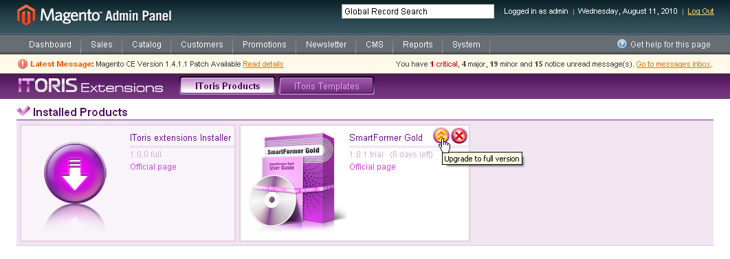
Find SmartFormer Gold in the list and press Install button. It will initiate installation. You can install the 7-day trial and activate it later on when you purchase a license. Or you can install the full version (you will need to enter license serial key then). Once the installation is started do not discontinue it.
When the installation of the trial is finished – you will see SmartFormer Gold among the list of available extensions.
You can upgrade to full version from there as well as update to the latest version or uninstall.
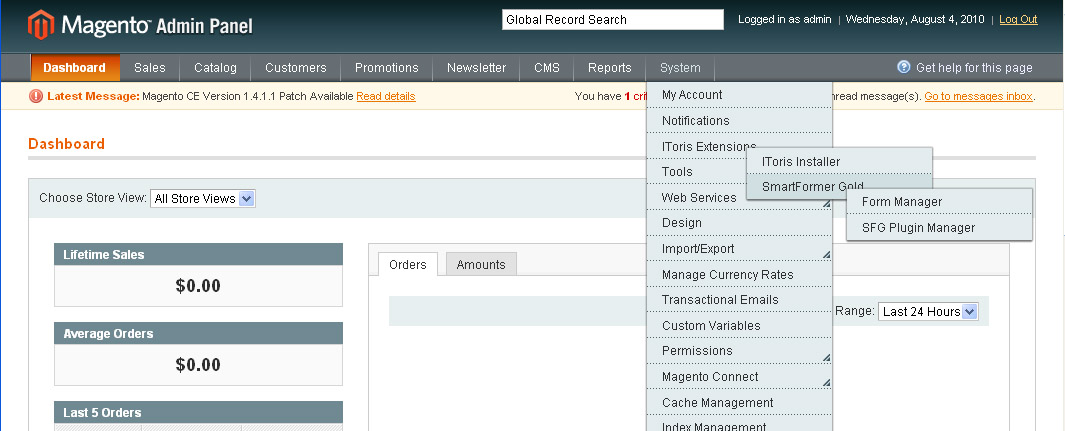
IToris Installer can be downloaded from //www.itoris.com/itoris-magento-installer.html Start of work with SmartFormer GoldWhen you open the back-end of the site installed SmartFormer Gold will be available from menu (System -> IToris Extensions -> SmartFormer Gold)
There are two sub-menus:
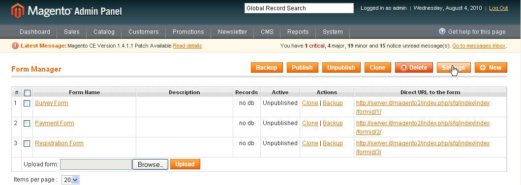
Main settingsSelect System -> IToris Extensions -> SmartFormer Gold -> Form Manager. You will see a list of forms created and control buttons on the top right. Press Settings button.
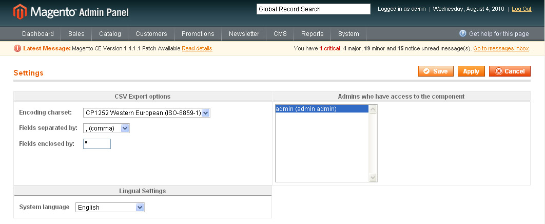
Here go the general settings of SmartFormer Gold. You can select administrators who will have access to the extension from the back-end. The following settings are available:
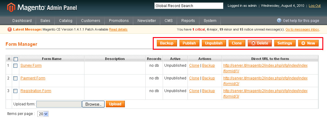
When settings are selected – press either Apply (changes will be saved, administrator will stay on the same page) or Save (changes will be saved, administrator will be directed to the Form Manager) button. Form Manager. ButtonsOn the top of the page you will have a number of buttons to manage your forms. If you need an action to be applied to several forms, please select them (by checking the checkboxes near them) and press a button.
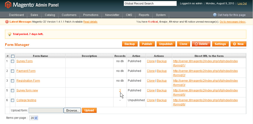
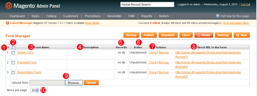
Form Manager. List of FormsThe list of forms contains the following:
* - number of records (how many times the form has been submitted). This number is a link clicking which you will see the list of submissions of this form.
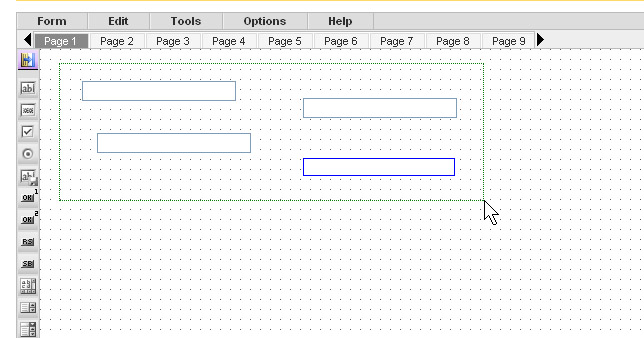
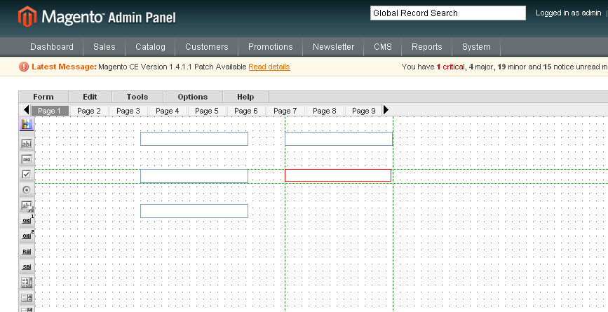
Form Manager. Working AreaGeneral description of Working areaWhen you open Smart Former Gold and press New button to create a new form, there is the main working area for creation the forms.
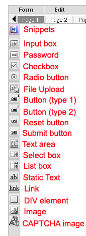
The area with cells will be used to drag elements to it. It can be enlarged by adding elements closer to the borders (will be stretched wider and longer). Above the area there go the pages of the form. If you need a one-page form, please create it on Page 1 (selected by defaults). If you need a multi-page form, please add the elements to Page 1, then switch to Page 2 and continue adding the elements. There are 10 pages available by defaults (you can leaf them through using All elements available to create the forms go on the left of the main working area. When the mouse is over the element, its name will be shown as the hint. To add an element please put the mouse over it, press the left button and, holding it, drag the selected element to the working area. HTML Elements
Select the element you need and drag it on the working area. To move the element select it and drag to the new place.
To delete the element select it and press Delete button on your keyboard.
You can also move/delete the group of elements together. To do it please select the elements by drawing the border round them with your mouse and apply an action to them together (mode, delete).
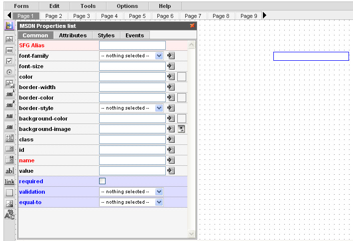
Each element has properties. When the element is active (after you dropped it or when you click on it) – the box with properties appears.
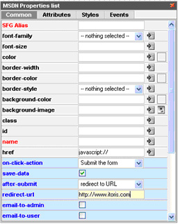
The properties depend on the element. Some of them are special ones and should be used by advanced users only, while the rest can easily be used to modify your elements on the form. The most important properties, that are available for each element, are SmartFormer Gold Alias and Name (they are red to attract attention).Please add them to all your active elements of the form.
SmartFormer Gold Aliasis the title of your element that you will see in admin area when you view the submitted forms. It will also be displayed in e-mail templates. Please add some clear name here. Your name can contain several words, numbers, underlining and special characters. Name is used to bind the element to the database. When user enters some data to the element (field), the data should be added to the database in most cases, so that you can see it in admin area. That is why it is crucial to add Names to your elements. Please add one work (underlining can be used), alphanumeric only.
Elements’ properties are divided into 4 tabs:
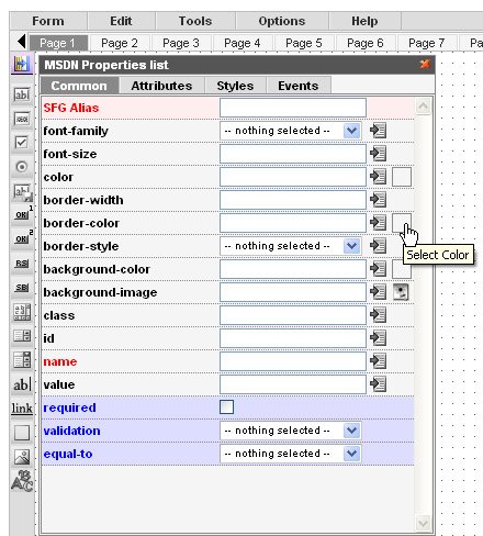
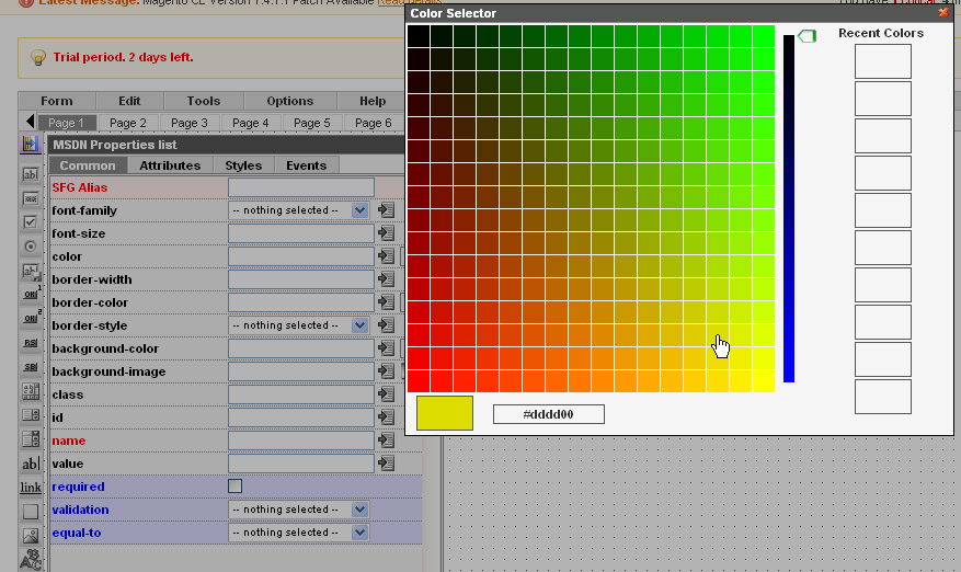
Common Properties of HTML ElementsSmartFormer Gold Alias – will be used in reports and email templates. Please always add this property to see the data, entered by your users, in correct format. Font settings – three settings are used to set the font – Font family (font type), Font size, Color’. To set the color please click the square near the property.
You will see the large Color Selector, where you can either choose the color or set its number. It will also contain the previously selected (recent) colors on the right.
You will see the list of available images: By clicking on any of them you will select it.
Check BoxThere can be a single check box, and there can also be a group of check boxes. If you have a group, and want it to be treated as a group (so that only one checkbox can be checked out of several ones.) please add the same Name attribute to all your check boxes. The name should contain [] at the end.
Button (type 1)
Here is the list of properties available for the button. The same properties will be available for image (in case image is used as button) and link element: On click action – what should be done if the button is clicked. The first-level options are the following (depending on the selection the new sub-options will be available):
After submit (what should be done after the form is submitted)
Date format
Custom JS line (enter the line here)
Button (type 2)This button has s different default style. The rest of attributes of this type of button are the same as with the previous button element.
Reset ButtonUse it if you need the entered data on the form to be cleared without the page’s overloading.
Submit ButtonUse it if you need the entered data on the form to be submitted.
use Button (type 1) or Button (type 2).
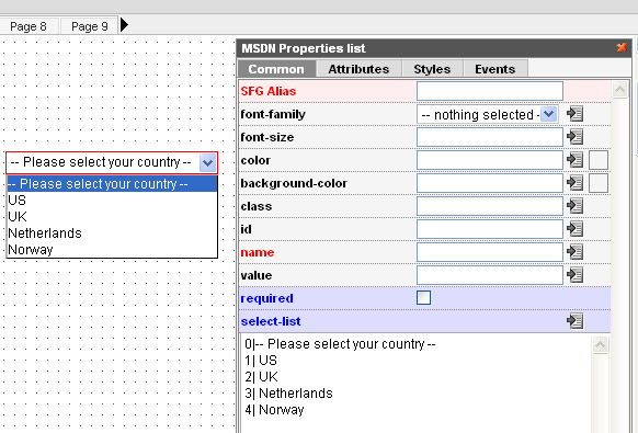
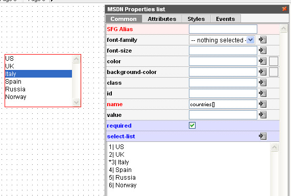
Select BoxPlease add the options for your select box in the following format: * value | option
0 | == Please select == 1 | US 2 | UK 3 | Italia 4 | Sweden 5 | Spain
0 value can not be selected (so you can add any attraction phrase like “please select” here”). “* “ will be used for the default item to be displayed. List BoxThe same logic of options is used here as with the Select box. List box allows multiple selections.In case you need the ability to select several items – please enter the following in the Name field of the List box – fieldname[]
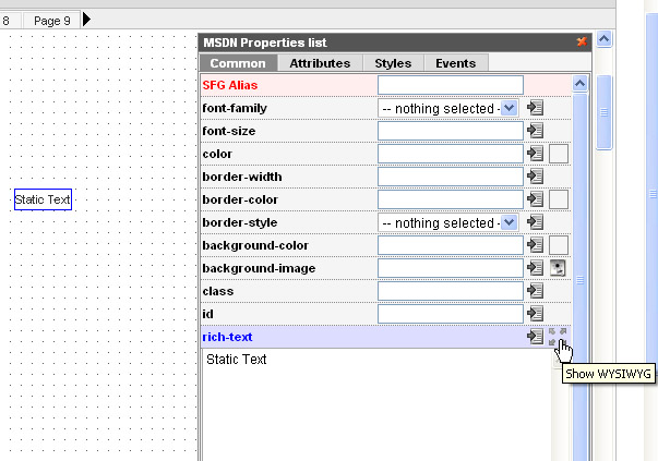
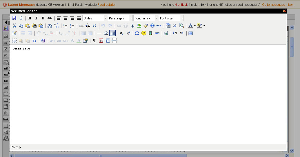
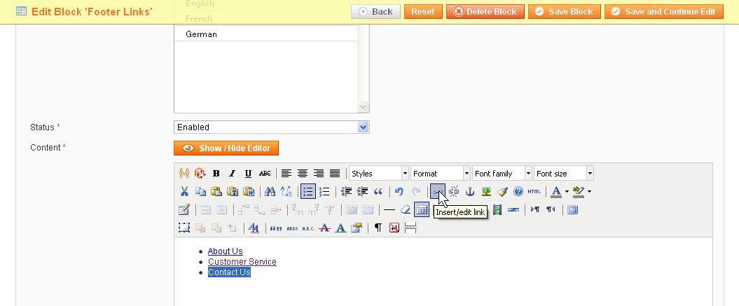
Static TextWYSIWYG can be used for text creation here. To open the WYSIWYG editor please click the icon in Static Text properties:
You will see the WYSIWYG editor where you can manage Static Text:
LinkLink element has the same on-click actions as Button element has. If the on-click action is set – it will behave like a regular link. If the on-click action is set – please add javascript:// to its href field.
Here you can also use WYSIWYG (like with Static text). DIV elementDiv element can be used the way you use tag in your HTML code. Please add custom HTML code to the element. Div can also be created via WYSIWYG means (same as Static text).
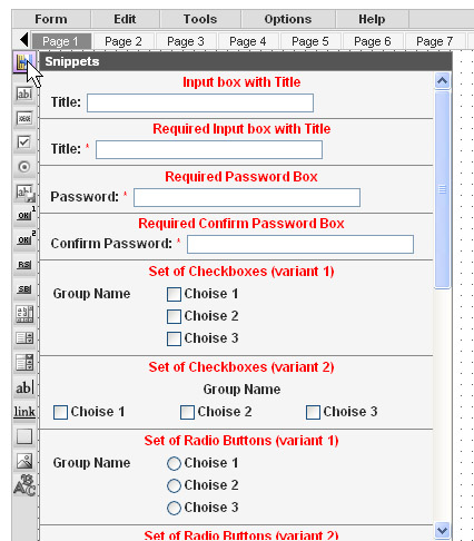
ImageImage can be used as a simple picture (e.g. you want to add a beautiful background to your form, or add a photo, etc.). It can also be used as a button or link (clicking on it will direct users to other pages or open up other websites). CAPTCHA ImageThe following elements are available for CAPTCHA: CAPTCHA type– please select one of the three types available. They differ with the images displayed CAPTCHA length – please select the quantity of symbols in your CAPTCHA CAPTCHA symbols – please enter the allowed symbols for CAPTCHA (you can avoid some confusing ones, e.g. 0 and O, etc.) CAPTCHA field – please select an edit box in which the users will enter the symbols from SnippetsThere are groups of elements that are usually used together. You can add these elements one by one, or can select the group in the Snippets. Please click the Snippets icon at the top of the HTML Elements’ list to see the available snippets.
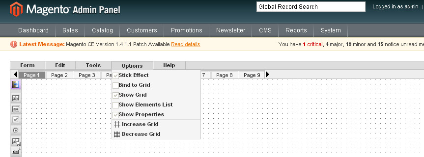
Snippets are added to the form the same way as the rest of elements (drag and drop). You can change the properties of any element in the snippet. Options of the working areaTo make the work with the form convenient, you can select the options for working area. The options can be managed from Options menu of Smart Former Gold. The following options are available:
Stick Effect – the following elements that you add to your form, will “stick” to the previous ones, so that to help you aligning them. You will seethe vertical and horizontal lines between the previous elements and the new one.
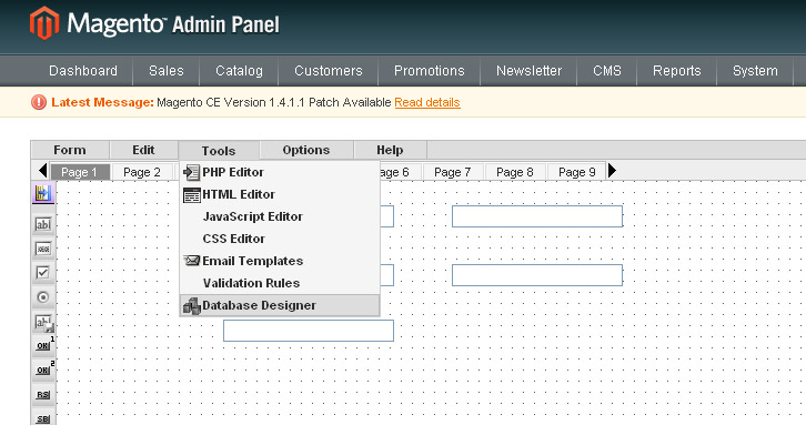
You can switch the effect on and off from the Options menu. Bind to Grid – if you activate this effect, you will move your elements vertically and horizontally cell by cell (each movement is one cell). Show Grid – displays or takes away cells Show Elements List – displays the list of all elements that are currently available on the form Show Properties – displays the properties of the selected element Increase Grid/Decrease Grid – makes the cells larger or smaller. DataBaseSmartFormer Gold provides direct access to the DB. When you create a new form – it should be associated with a DB if you want submissions from it to be saved. To open DataBase Designer select it from SmartFormer Gold menu (Tools -> Database Designer)
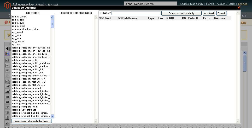
If your form transmits data to some other place (a payment gateway), or works with the existing data, that does not need saving (Login form) – you do not need to create a new database table for it. If the data that users enter in your form should be saved, you need to create a new database table, where this data will be kept, and bind the table to you form. Your submit button should have “save-data” option enabled. Please click the button and check the “save-data” checkbox. Create a new DB table and bind your form to itPlease bind the form to DB only when the form is ready. To bind the form and DB table please open the form, then select Tools ->Database Designer.
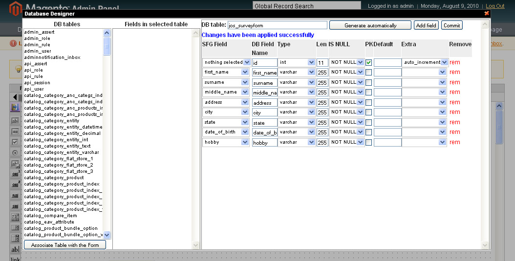
Press Generate Automatically button, then enter the name of your new DB table and press Commit button. You will see the table structure and message “Changes have been applied successfully”. After that the designer can be closed.
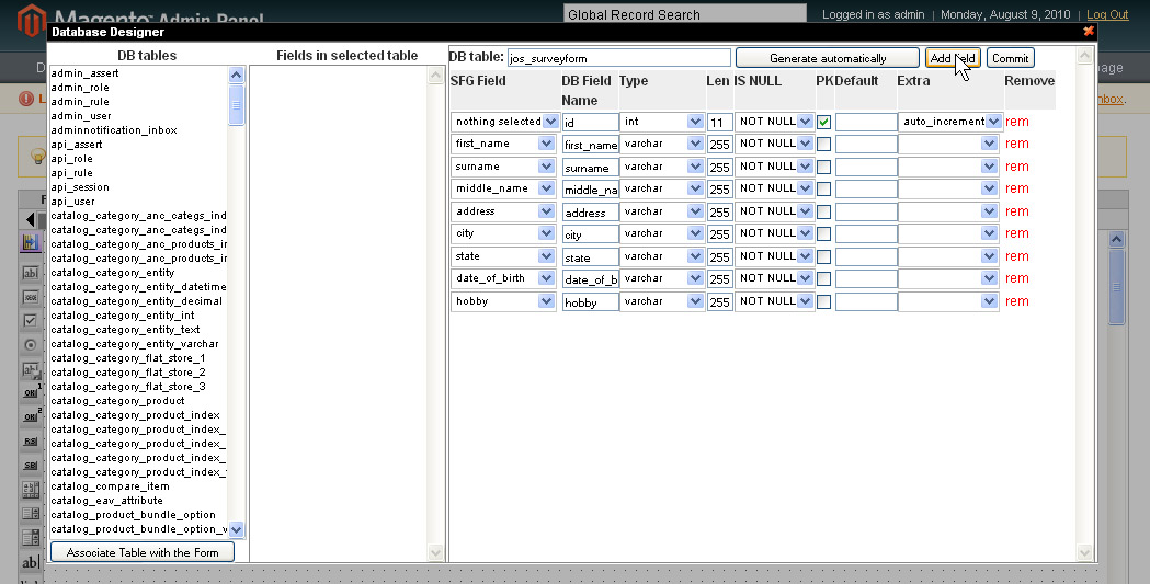
Save the form after any changes in DB. Add new fields to DB (manually). Delete fieldsIf you add new fields to your form after the DB table has been created for it – they should be added to the table as well, otherwise the data entered in these new fields will not be saved. If your form has submissions already – please add new fields manually (if you re-generate DB table – all previous data will be overwritten). To add a field manually open Database Designer from your form. You will see the current table’s structure. Press Add Field button.
A new field will appear on the bottom of the structure. You will need to add its:
After the new elements are added – press Commit button to save the changes. Save the form after any changes in DB. Check if the form is bound to a DB table or notIf you are not sure if your form has association with DB or not – open the list of forms (Form Manager) and check Records column.
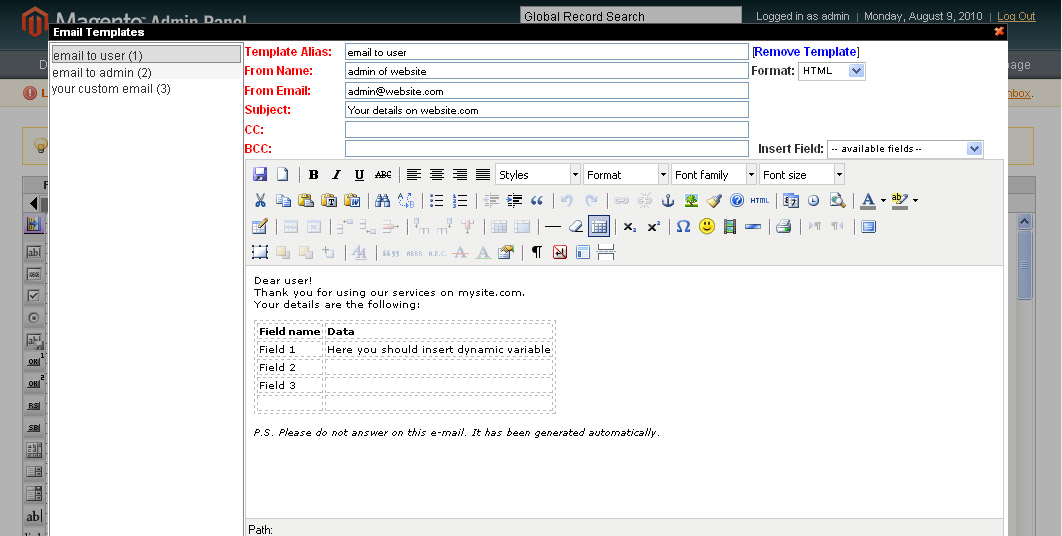
no db – your form has no association with DB 1 (or any other number) – your form has a DB table and has submissions -- - your form has a DB table but has no submissions yet. Bind your form to an existing DB table (advanced users only!!!)If you need the data from your form to be written to an existing DB table, you can select the table from the left (all available tables in you DB). When the table is selected (you will see all its fields in the middle) press Associate table with the form button. After that you can associate the form’s field with the table’s fields. Email NotificationsSmart Former Gold allows sending email notifications to different users. To do that you should do two things: Create email templatesEmail templates are the skeletons of your emails. They will contain the subject, the email of the “author” (administrator’s email or support email, etc.), the text of the email and dynamic variables that will be substituted with the data, entered to the forms. To create/edit email templates please open your form and select Tools -> Email Templates from Smart Former Gold’s menu:
On the left you will see the list of available templates. To edit one of the existing ones please click it. The mail part contains the full text and data of the selected email template. There is the header, where you can select, if the email should be HTML or plain text. You can add the alias of the template, Subject, From information, CC and BCC here as well. The area for text is the WYSIWYG. Please add the text of email here. Then add the dynamic variables from the drop down “Insert Fields”. This drop down contains all elements of your form. When you add an element as variable, in the real email user will see the data, which has been entered in this filed, instead of the variable.
Where {user_name} is the name of the field from you form, where users add their name. Then in the real email a user will see Dear John Smith To create a new template please select New Document icon in the WYSIWYG. Create the template and save it by pressing Save icons in the WYSIWYG. All templates that have been edited should be saved as well.
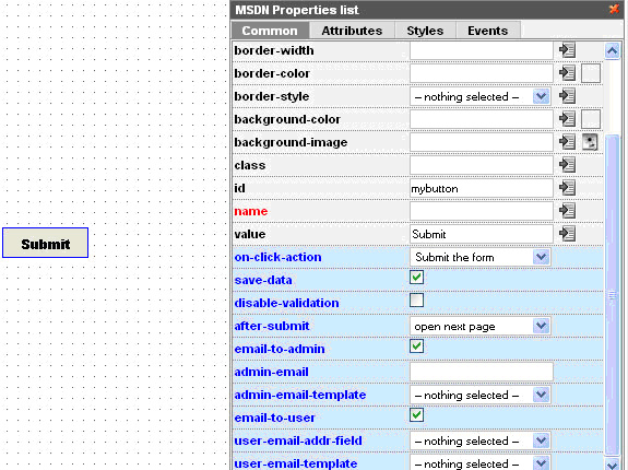
Bind form to email templateTo send the emails when the form is submitted you will need to bind the form to the created email templates. To do it please open your form and select the submit button. You will see its properties
If you want to send notifications to administrator – please check “email-to-admin” check box. There will appear additional fields “admin-email”, where you should enter the email address of administrator (to which the notifications should be sent) and “admin-email-template”, where you select the name of template according to which the email should be formed. If you want to send the notifications to users (who submit the form), please check “email-to-user” check box. You will see the additional fields “user-email-addr-field”. As we do not know the user’s email in advance, user enters it when submitting the form, we will select the field here, in which the user will enter his/her email. In this drop down all input boxes from your form will be available. Please select your “email” input box. You should also select the template for user email notifications. Please select the one you need from “user-email-template” field. After that please save your form. Now your users and/or administrator will receive email notifications. Make your form available from the front-endCheck the form using its direct URL before submittingAfter your form is created, bound to the DB (if needed) and has the email templates enabled and associated with the form (if needed) you can make your form available from the front-end. First of all, please make sure your form works correctly before your users start working with it. Find your form in the list of forms and check that it is published. If it is not – check it and press Publish button. There is the Direct URL of your form available here. Following it you can open published your form in the front-end directly. Please fill in and submit your form. Make sure it is displayed correctly, and all settings are available in it. Publish your form using its direct URLForm can be bound directly to a menu item with its direct URL.
Add new link text in WYSIWYG, click Insert/Edit link icon and paste the direct URL of the form.
Save the changes. Now clicking this new link will open up the form. Insert a form in file layoutTo insert a form in the layout of a file do the following:
This form’s ID=6
<reference name="content">
<block type="Itoris_Sfg/Form" name="Form" template="sfg/index/index.phtml">
<action method="setData"><key>formid</key><value>6</value></action>
</block>
</reference>
where 6 is the ID of your form.
Add a form to a CMS pageTo add a form to a CMS page do the following:
{{block type="Itoris_Sfg/Form" formid="6"}} where 6 is the ID of the form
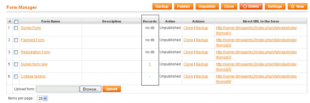
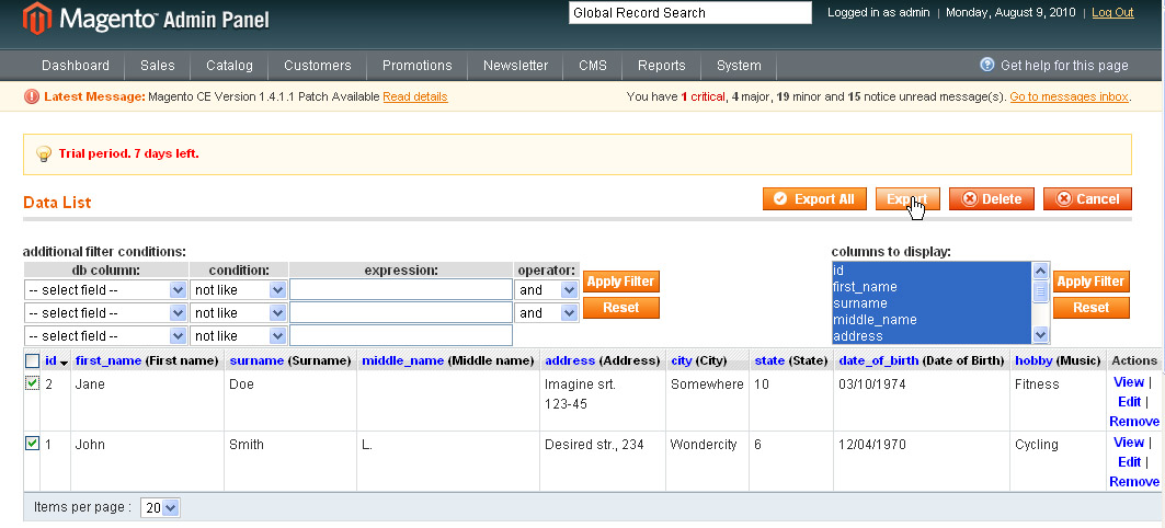
Work with submitted dataView the dataWhen your form is ready and available from the front end – your users can submit it. All submitted data can be managed. Please find the form, the submissions of which you need, in the list of forms. It will display a number in Records column – how many times it has been submitted.
On the image we can see that Survey form new has been submitted two times. To view the submissions click the number. You will see the list of submissions.
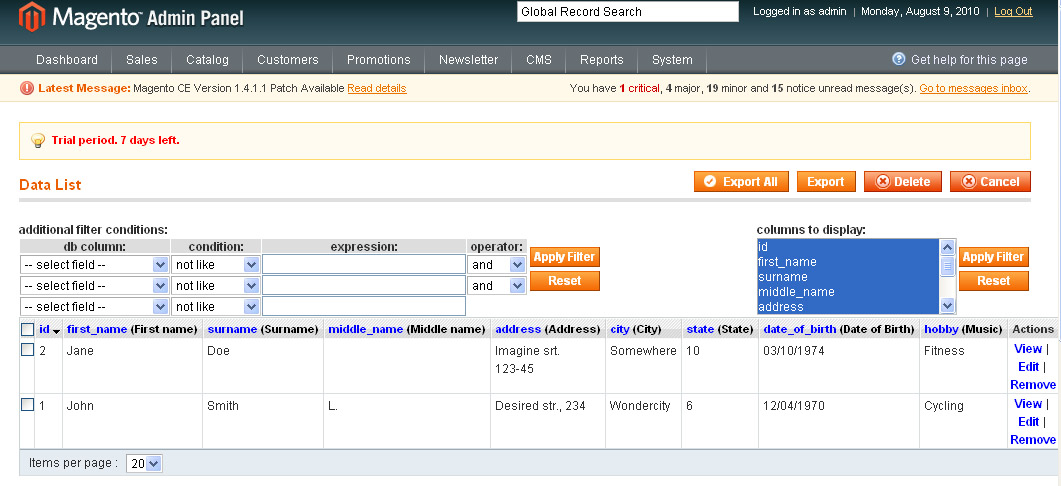
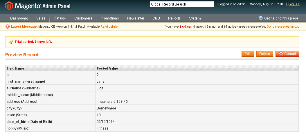
On the top there is a filter to find a submission (record) and ability to display selected columns only. Each submission goes in the list. You can view, edit or remove a submission (Actions). If you click View link – you will see full details on the submission.
You can edit a submission, this will re-write initially submitted information in the DB. You can physically delete a submission. Export the dataYou can export the submitted data to .csv Please either select the submissions that should be exported (by checking their checkboxes) or export all of them together. Export All button will export all available submissions to .csv file Export button will export the selected submissions to .csv file
Additional Tools available in SmartFormer GoldThe tools available in SmartFormer Gold are the following:
|
 Important notices
 Example
 For advanced users
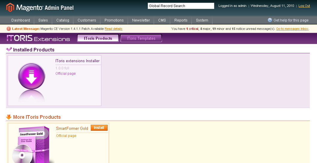
 # of form. This number defines the order of form creation. Forms created earlier will go higher.
 Bulk management. Each form has a checkbox. There is a top checkbox as well that checks all forms together. Several forms can be selected, then you press a button and the action is applied to all selected forms together.
 Form name. Title of the form you enter (used to inner purposes). It is a link clicking which you open the form up for editing.
 Description. Description of forms is used in the back-end only for inner purposes.
 Records. This column shows 1. if the form has bound to DB or not. 2. If the form has been submitted or not, and how many times
 Active. If the form is active or not. Only active forms are available from the front-end.
 Actions. There are two default actions – Clone (creates a copy of the form) and Backup (creates a backup of the form to be saved locally)
 Direct URL to the form. You can test the form without settling it on the site – make it active and press direct URL. Direct URL also shows the actual ID of the form (the number at the end).
 Form Upload. You can upload a backup of the form saved locally.
 Items per page. You can select how many forms there should be displayed per page if there are plenty of forms.
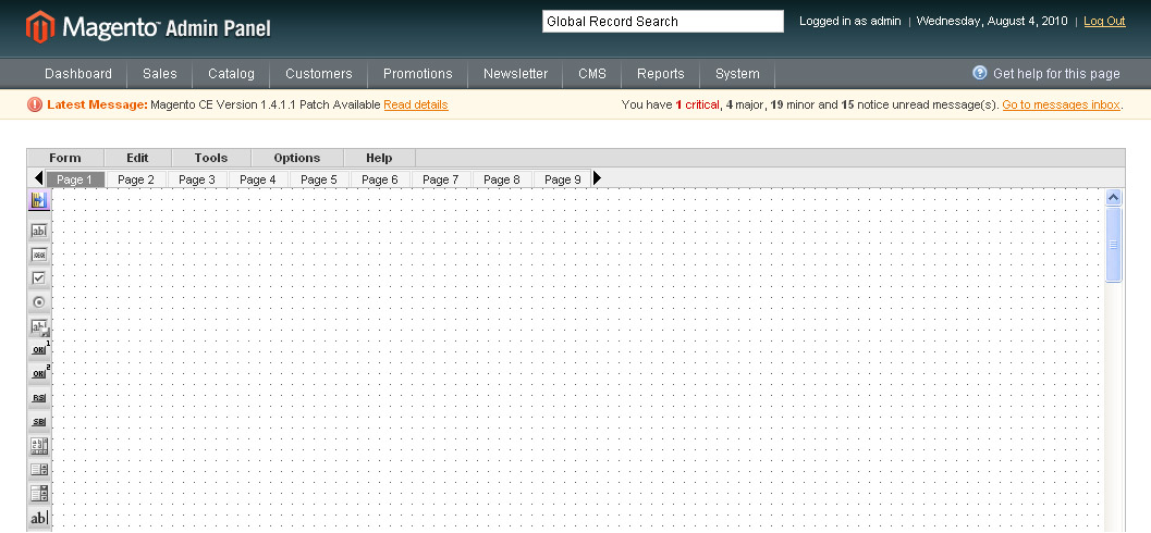
 and
and  arrows. To add more pages please leaf till the end of the area and click add new button. By clicking it you may add as many pages as you need.