


Username
Password
Remember Me
Log in
Forgot your password?
Forgot your username?
Forgot your username?
|
SmartFormer Gold Documentation
PurposeSmartFormer Gold is the Joomla form builder developed for professional purposes mostly. Developers will find hundreds of abilities to create and customize the forms fast and in an extremely convenient way. SmartFormer Gold provides the usable and intuitive interface. Prompt drag and drop feature, drop down menus, hot keys will create the impression you deal with your favorite desktop application. Large complex forms are especially convenient to be created with Smart Former Gold.
System RequirementsSmart Former Gold is provided for Joomla 1.5.x and higher. So that to guarantee the correct work of the component, special technical requirements should be met. They are:
Supported Browsers
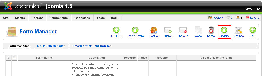
Default Updating - AutomatedRegular updates are provided for Smart Former Gold. The update can be accomplished either automatically or manually. Auto-update feature will check the new releases and set the updates each time they are available and you are online.
Manual UpdatingIf you prefer updating your Smart Former Gold manually – you can check the change log on IToris forum and decide if you need the changes or not. In case you need them – press Update button to download the updates.
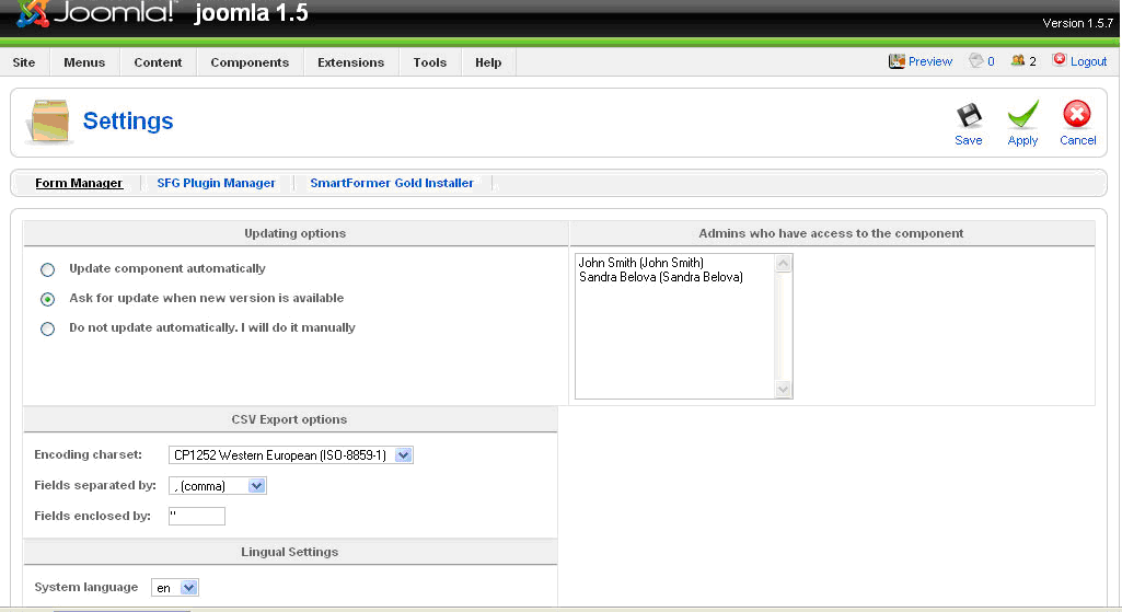
Set Update PreferencesTo set the preference of updating please click on Settings button.
You will see three Updating Options:
Please select the one you need and save the changes.
SmartFormer Gold SettingsApart from updating options there are several other settings available for SmartFormer Gold.
Admins who have access to SmartFormer GoldAll super administrators will have access to the component. Yet you can limit the access of administrators. In the box you will see all available administrators of the site. Please select the ones who will have access to SmartFormer Gold and save the changes.
CSV Export OptionsTo provide the correct export of submitted data to the .csv file please check the settings. Select your charset and the correct separators (they differ depending on your charset, language and location).
Language settingsThere are plenty of languages available for SmartFormer Gold. Please select the one you need in Language settings and save the changes. The interface of SmartFormer Gold will be translated to the selected language automatically.
Installation
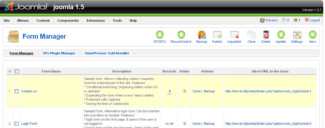
Work with SmartFormer Gold - Form ManagerTo start working with Smart Former Gold please open it in administration area of your website (Components-> SmartFormer Gold-> Form Manager).
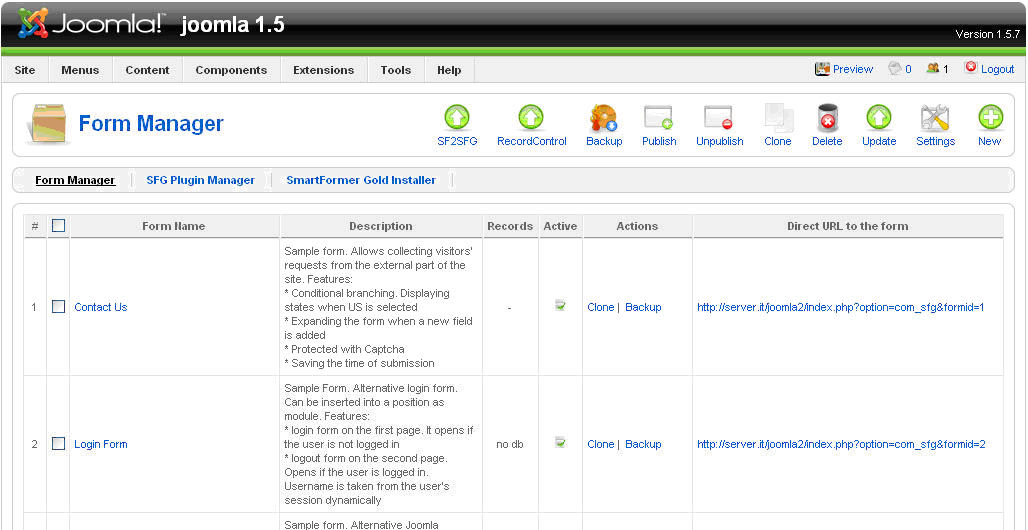
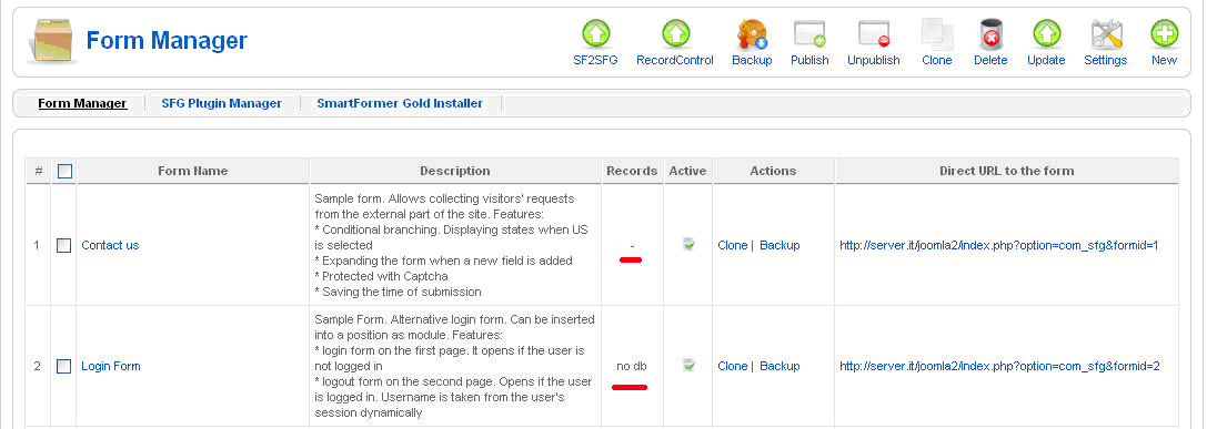
You will see the list of all your available forms. You can create a new form by clicking New button, edit and manage the existing ones.
Buttonsn the top of the page you will have a number of buttons to manage your forms. If you need an action to be applied to several forms, please select them (by checking the checkboxes near them) and press a button.
There are also buttons for SmartFormer Gold management:
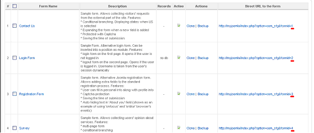
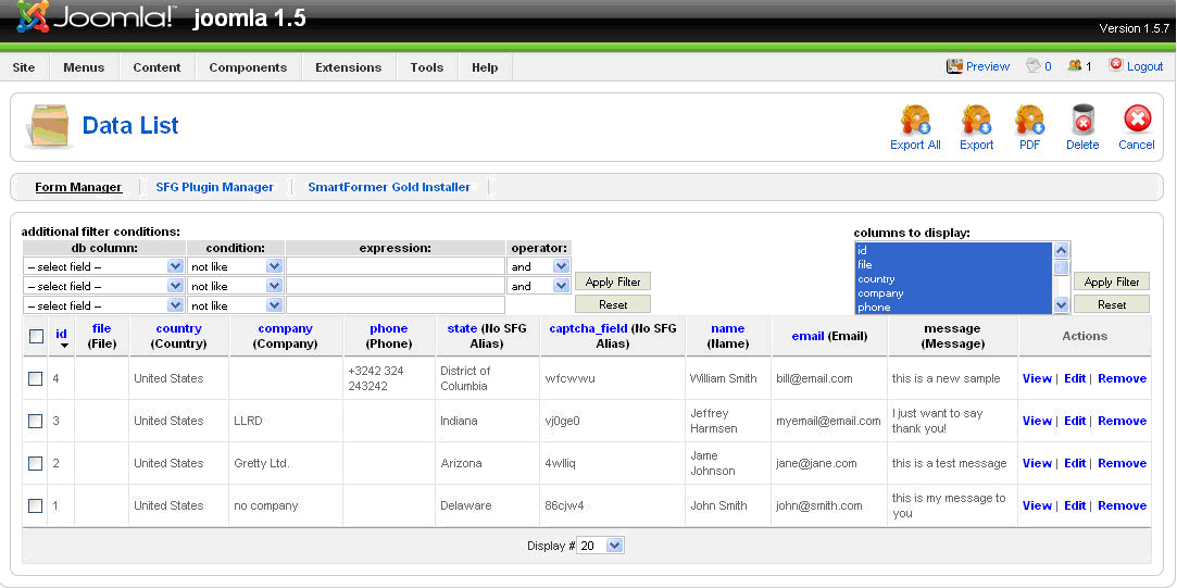
List of FormsThe list of forms contains the following columns:
E.g. Img. 3 displays two forms. “Contact Us” form is bound to the database and has not been submitted by user yet. Form “Login Form” is not bound to the database.
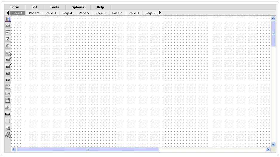
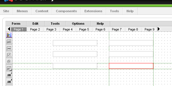
Working AreaWhen you open Smart Former Gold and press New button to create a new form, there is the main working area for creation the forms.
The area with cells will be used to drag elements to it. It can be enlarged by adding elements closer to the borders (will be stretched wider and longer). Above the area there go the pages of the form. If you need a one-page form, please create it on Page 1 (selected by defaults). If you need a multi-page form, please add the elements to Page 1, then switch to Page 2 and continue adding the elements. There are 10 pages available by defaults (you can leaf them through using All elements available to create the forms go on the left of the main working area. When the mouse is over the element, its name will be shown as the hint. To add an element please put the mouse over it, press the left button and, holding it, drag the selected element to the working area.
HTML Elements
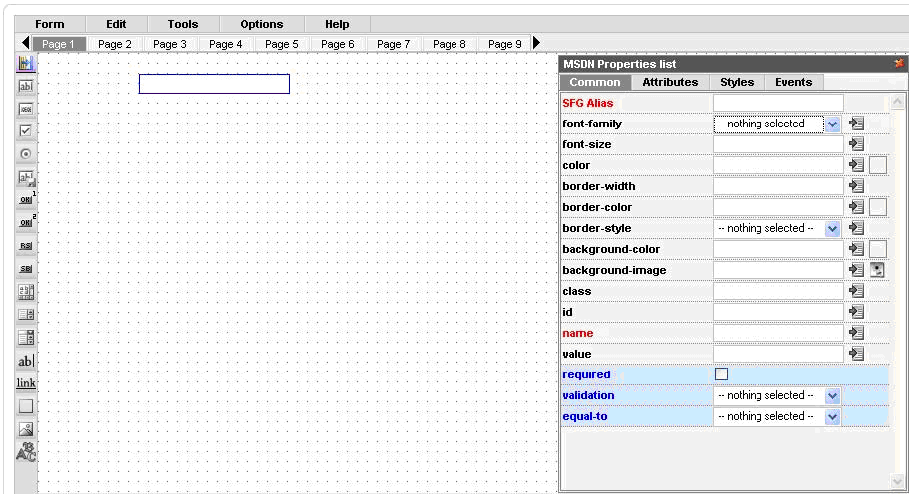
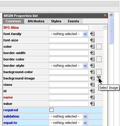
Select the element you need and drag it on the working area. To move the element select it and drag to the new place. To delete the element select it and press “Delete” button on your keyboard. You can also move/delete the group of elements together. To do it please select the elements by drawing the border round them with your mouse. Each element has properties. When the element is active (after you dropped it or when you click on it) – the box with properties appears. The properties depend on the element. Some of them are special ones and should be used by advanced users only, while the rest can easily be used to modify your elements on the form. The most important properties, that are available for each element, are SFG Alias and Name. Please try to add them to all your elements of the form.
SFG Aliasis the title of your element that you will see in admin area when you view the submitted forms. It will also be displayed in e-mail templates. Please add some clear name here. Your name can contain several words, numbers, underlining and special characters. Name is used to bind the element to the database. When user enters some data to the element (field), the data should be added to the database in most cases, so that you can see it in admin area. That is why it is crucial to add Names to your elements. Please add one work (underlining can be used), alphanumeric only. Elements’ properties are divided into 4 tabs:
Common Properties of HTML Elements
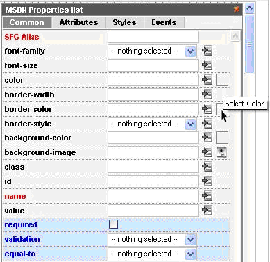
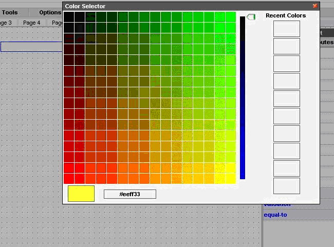
You will see the large Color Selector, where you can either choose the color or set its number. It will also contain the previously selected colors at the right.
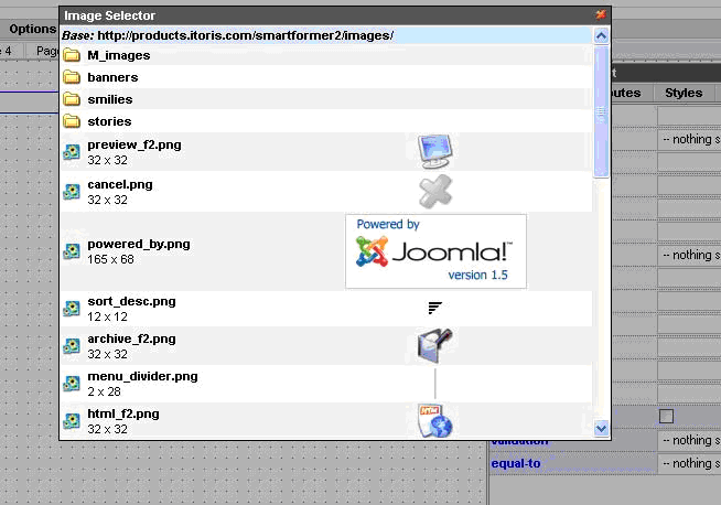
You will see the list of available images: By clicking on any of them you will select it.
Check BoxThere can be a single check box, and there can also be a group of check boxes. If you have a group, and want it to be treated as a group (i.e. one option out of several ones is selected) please add the same Name attribute to all your check boxes. The name should contain [] at the end. E.g. “elementsname[]”
Button (type 1)
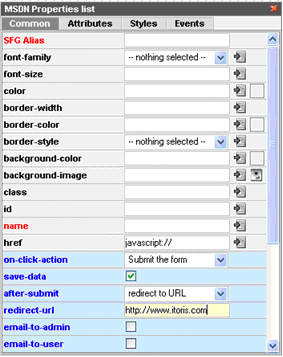
Here is the list of properties available for the button. The same properties will be available for image (in case image is used as button) and link element: On click action – what should be done if the button is clicked. The first-level options are the following (depending on the selection the new sub-options will be available):
After submit (what should be done after the form is submitted)
Date format
Custom JS line
Button (type 2)This button will provide the rounded edges. The rest of attributes of this type of button are the same as with the previous button element.
Reset ButtonPlease use it if you need the entered data on the form to be set default without the page’s overloading
Submit ButtonPlease use it if you need the entered data on the form to be submitted.
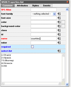
Select BoxPlease add the options for your select box in the following format: * value | option E.g. 0 | == Please select == 1 | US 2 | UK 3 | Italia 4 | Sweden 5 | Spain “0|” will NOT be participated in selection. If you set ‘Required’ check box, the item having “0” value can not be selected (so you can add any attraction phrase like “please select” here”). “* “ will be used for the default item to be displayed.
Value is what will be displayed in emails and when you view the submitted data. That is why if you do not want "1", "2", "3" etc. to be echoed - please set the same value and option, e.g. "blueberry | blueberry".
List BoxThe same logic of options is used here as with the Select box. List box allows multiple selections. In case you need the ability to select several items – please enter the following in the name field of the List box – yourname[ ]
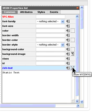
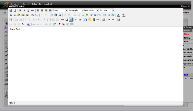
Static TextWYSIWYG can be used for text creation here. To open the WYSIWYG editor please click the icon in Static Text properties:
You will see the WYSIWYG editor where you can manage Static Text:
LinkLink element has the same on-click actions as Button element has.If the on-click action is set – it will behave like a regular link. If the on-click action is set – please add javascript:// to its href field.
Here you can use WYSIWYG:
DIV elementDiv element can be used the way you use tag in your HTML code. Please add custom HTML code to the element.Div can also be created via WYSIWYG:
ImageImage can be used as a simple picture (e.g. you want to add a beautiful background to your form, or add a photo, etc.). It can also be used as a button or link (clicking on it will direct users to other pages or open up other websites).
CAPTCHA ImageThe following elements are available for CAPTCHA:
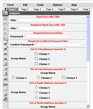
SnippetsThere are groups of elements that are usually used together. You can add these elements one by one, or can select the group in the Snippets. Please click the Snippets icon at the top of the HTML Elements’ list to see the available snippets.
Snippets are added to the form the same way as the rest of elements. You can change the properties of any element in the snippet.
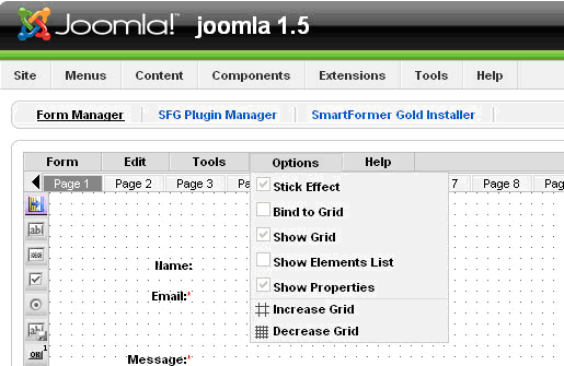
Options of the working areaTo make the work with the form convenient, you can select the options for working area. The options can be managed from Options menu on Smart Former Gold. The following options are available:
Stick Effect – the following elements that you add to your form, will “stick” to the previous ones, so that to help you aligning them. You will seethe vertical and horizontal lines between the previous elements and the new one.
You can switch the effect on and off from the Options menu. Bind to Grid – if you activate this effect, you will move your elements vertically and horizontally cell by cell (each movement is one cell). Show Grid – displays or takes away cells Show Elements List – displays the list of all elements that are currently available on the form Show Properties – displays the properties of the selected element Increase Grid/Decrease Grid – makes the cells larger or smaller.
Working with DatabaseIf your form transmits data to some other place (a payment gateway), or works with the existing data, that does not need saving (Login form) – you do not need to create a new database table for it. If the data, that users enter in your form, should be saved, you need to create a new database table, where this data will be kept, and bind the table to you form. Your submit button should have “save-data” option enabled. Please click the button and check the “save-data” checkbox.
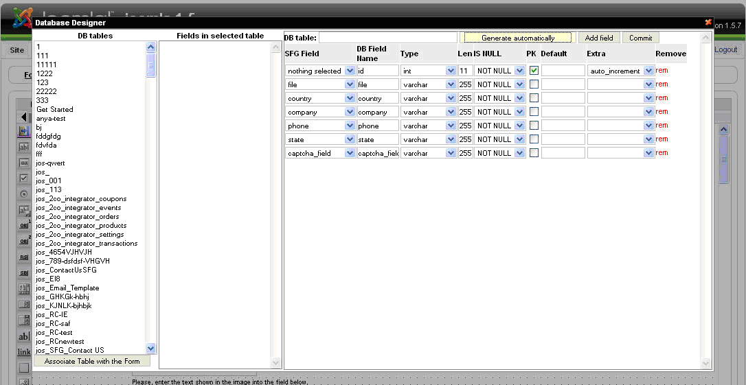
Create a new DB table and bind your form to itPlease bind the form to DB only when the form is ready. If you add new fields to your form after that – they should be added to the table as well, otherwise the data entered in these new fields will not be saved. To bind the form and DB table please open the form, then select Tools ->DataBase Designer. The table will be automatically generated to the filed of your form
In the right area you will see the list of your form’s fields. Here you can change their properties (only if you know what you do!!!). In the majority of cases you will need to add the name of this newly created table and press Commit button. If you add new fields to the form, which has already been bound to the DB table, there are two possible variants:
After that save your form and close it. Then find it in the list of forms. Now it should have “-” in the Records column. If your form has “no db” here – it is not bound to DB. If your form has a digit here – it is bound to the DB and has been submitted already.
Bind your form to an existing DB table (advanced users only!!!)If you need the data from your form to be written to an existing DB table, you can select the table from the left (all available tables in you DB). When the table is selected (you will see all its fields in the middle) press Associate table with the form button. After that you can associate the form’s field with the table’s fields.
What to do, if you can not associate your form with DBIf you follow the instructions, but the form is not associated with the DB, and shows “no db” in the Records column, please check the following:
To check it please open your form, click the first field and make sure it has name and it is correct. Then select another, etc. It changes have been made – re-bind the form to the DB and re-save it.
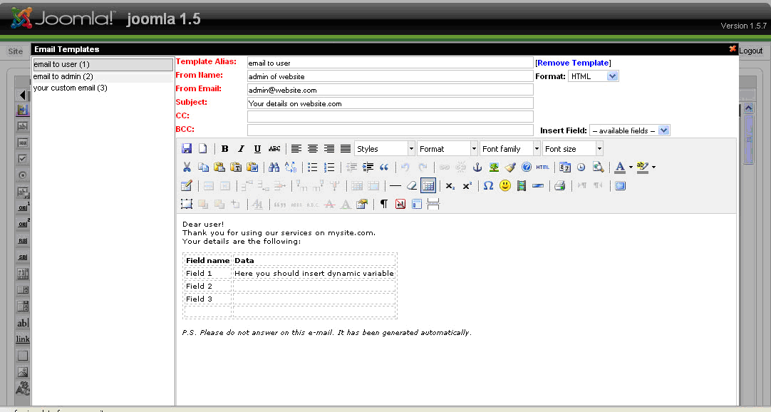
Email NotificationsSmart Former Gold allows to send email notifications to different users Create email templatesEmail templates are the skeletons of your emails. They will contain the subject, the email of the “author” (administrator’s email or support email, etc.), the text of the email and dynamic variables, that will be substituted with the data, entered to the forms. To create/edit email templates please open your form and select Tools -> Email Templates from Smart Former Gold’s menu:
On the left you will see the list of available templates. To edit one of the existing ones please click it. The mail part contains the full text and data of the selected email template. There is the header, where you can select, if the email should be HTML or plain text. You can add the alias of the template, Subject, From information, CC and BCC here as well. The area for text is the WYSIWYG. Please add the text of email here. Then add the dynamic variables from the drop down “Insert Fields”. This drop down contains all elements of your form. When you add an element as variable, in the real email user will see the data, which has been entered in this filed, instead of the variable. E.g. You text is Dear {user_name} Where {user_name} is the name of the field from you form, where users add their name. Then in the real email a user will see Dear John Smith To create a new template please select New Document icon in the WYSIWYG. Create the template and save it by pressing Save icons in the WYSIWYG. All templates that have been edited should be saved as well.
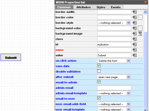
Bind form to email templateTo send the emails when the form is submitted you will need to bind the form to the created email templates. To do it please open your form and select the submit button. You will see its properties
If you want to send notifications to administrator – please check “email-to-admin” check box. There will appear additional fields “admin-email”, where you should enter the email address of administrator (to which the notifications should be sent) and “admin-email-template”, where you select the name of template according to which the email should be formed. If you want to send the notifications to users (who submit the form), please check “email-to-user” check box. You will see the additional fields “user-email-addr-field”. As we do not know the user’s email in advance, user enters it when submitting the form, we will select the field here, in which the user will enter his/her email. In this drop down all input boxes from your form will be available. Please select your “email” input box. You should also select the template for user email notifications. Please select the one you need from “user-email-template” field. After that please save your form. Now your users and/or administrator will receive email notifications.
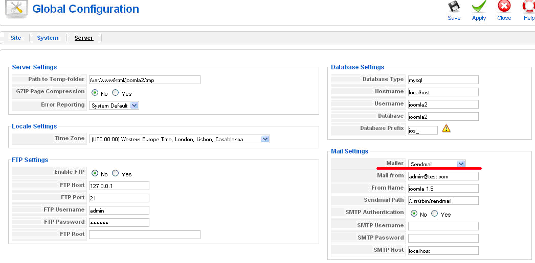
What to do, if two previous steps are completed, but no email are sentIf you fulfilled the steps, i.e. created the email templates and bound them to submit button, as well as activated the emails’ sending in the buttons’ properties, yet still no emails are being sent, please do the following. Come to the next step only after making sure the previous do not help: 1. Please make sure the emails do not appear on Spam of Junk folders 2. Open Joomla configuration page in admin area of your website (Site ->Global Configuration -> Server) Try to change the mailer here. If your webserver runs on Windows platform - choose 'SMTP Server'. If on Linux/Unix/Solaris platform - choose 'PHP Mail function' or 'Sendmail'.
3. If that has no effect check whether Joomla can send emails itself. Register a new user via admin panel, and enter your email address as his/her email. The system should send email to the user's email address. Make sure that you receive it. If you do not receive it – please describe the problem that you can not send emails from your website to your hosting providers. 4. If you receive it, yet you do not receive the emails from Smart Former Gold – please contact our support department.
Make your form available from the front-endAfter your form is created, bound to the DB (if needed) and has the email templates enabled and associated with the form (if needed) you can make your form available from the front-end. First of all, please make sure your form works correctly before your users start working with it. Find your form in the list of forms and check that it is active (published) There is the Direct URL of your form available here. Following it you can open published your form in the front-end directly. Please fill in and submit your form. Make sure it is displayed correctly, and all settings are available in it.
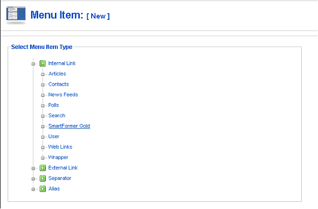
Bind a form to a menu itemSelect the form you need to bind to a menu and check its ID. The ID is the last number in the form’s direct URL
Go to Joomla Menus, select the menu you want to include the item to and press New button. Then select Smart Former Gold form the list of menu types:
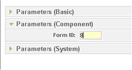
Add the title, alias, parent item, etc. On the right click parameters (component) and add the ID of your form.
Save the changes. Now your form will be available when clicking the menu item.
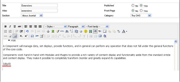
Insert a form into Joomla’s static pageThe form can be inserted to the static page. To do so you should know the form’s ID. On the Form Manager there is the full list of all forms available. Each of them has the direct URL (which allows previewing the form without publishing it). The last number in the URL is the form’s ID.
Please select and open the page in which the form should be inserted. In the place where the form should go please add the following: , where ID is the form’s ID. Save the page.
The form will be added to the static page.
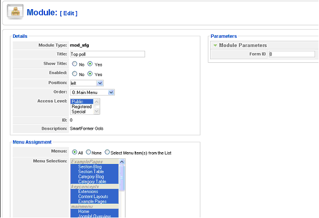
Add a form to a moduleModule will give the ability to insert the form on any block of the page. To create the module please do the following:
Work with submitted data - View the dataWhen your form is ready and available from the front end – your users can submit it. All submitted data can be managed. Please find the form, the submissions of which you need, in the list of forms. It will display a digit in Records column – how many times it has been submitted.
Please click this digit to see the submissions.
You will see the submissions here. Above them there is a filter on the left, using which you can display only the submissions you need. You can also use the filter on the right so see only the selected fields of your form.
Export the dataYou can export the submitted data to .xls. Please either select the submissions that should be exported (by checking their checkboxes) or export all of them together. Export All button will export all available submissions to .xls file
Additional Tools available in SFGThe tools available in SFG are the following:
UninstallingThe deinstallation of Smart Former Gold is applied through the standard Joomla! Uninstall process. Please choose Installers -> Components in the admin area of your web site. The Installed Components’ list contains all currently installed components. Please check the one you wish to uninstall and press Uninstall button. The component will be uninstalled.
data will be available again. |
 Incorrect settings can cause the problems with export to .csv files (the data can be mixed or not readable). If you face the problems – please try to change the settings. If the problems still appear – please contact Support Department of IToris.
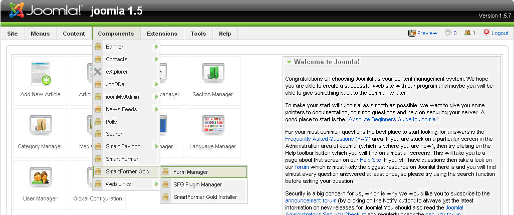
 and
and  arrows. To add more pages please leaf till the end of the area and click
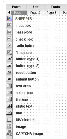


 If it is not –click the unpublished icon
  to make it published.